Classic.CommonControls.Avalonia
11.2.0.3
See the version list below for details.
dotnet add package Classic.CommonControls.Avalonia --version 11.2.0.3
NuGet\Install-Package Classic.CommonControls.Avalonia -Version 11.2.0.3
<PackageReference Include="Classic.CommonControls.Avalonia" Version="11.2.0.3" />
paket add Classic.CommonControls.Avalonia --version 11.2.0.3
#r "nuget: Classic.CommonControls.Avalonia, 11.2.0.3"
// Install Classic.CommonControls.Avalonia as a Cake Addin #addin nuget:?package=Classic.CommonControls.Avalonia&version=11.2.0.3 // Install Classic.CommonControls.Avalonia as a Cake Tool #tool nuget:?package=Classic.CommonControls.Avalonia&version=11.2.0.3
 Classic.Avalonia
📢 If you have used Classic.Avalonia, share your app here!
Overview
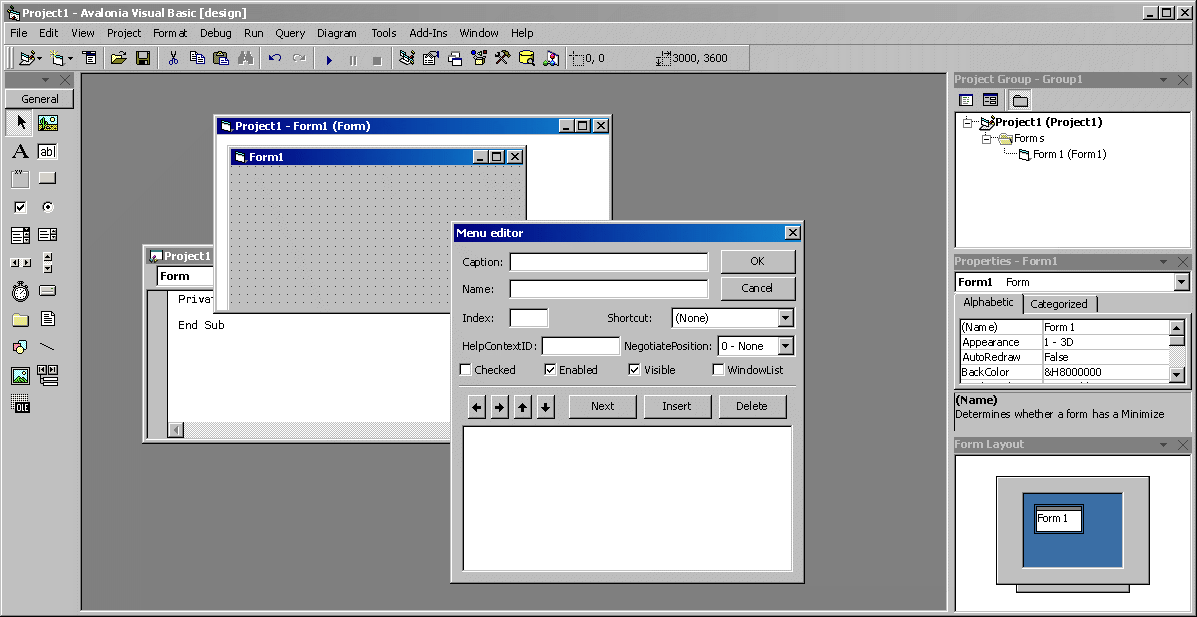
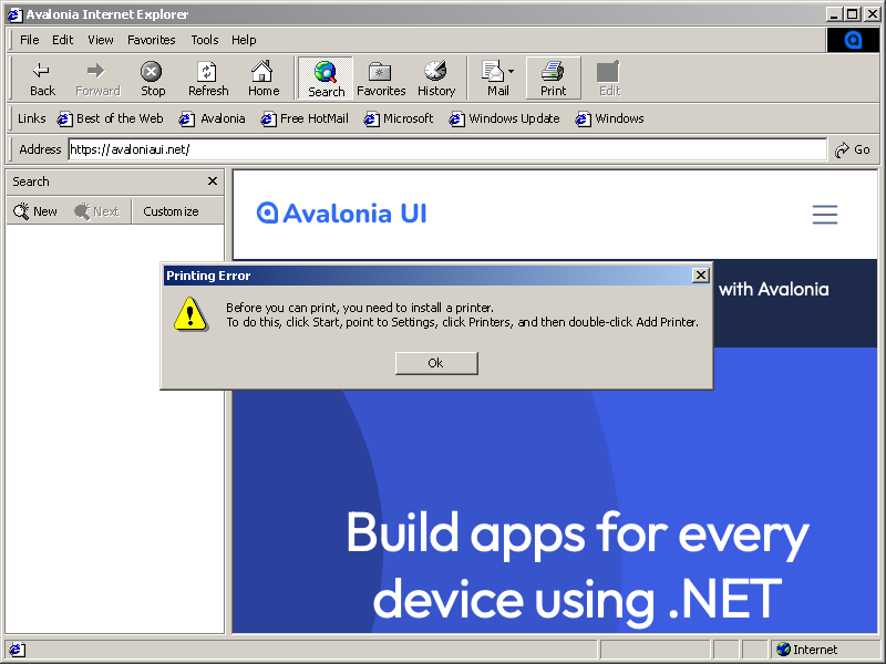
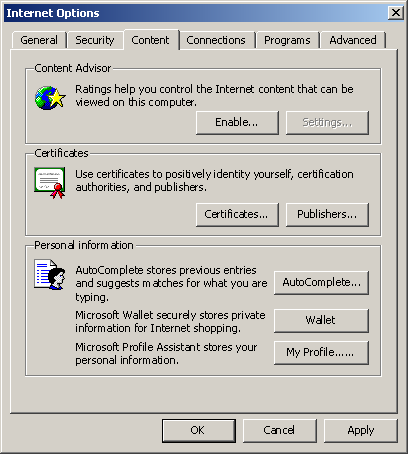
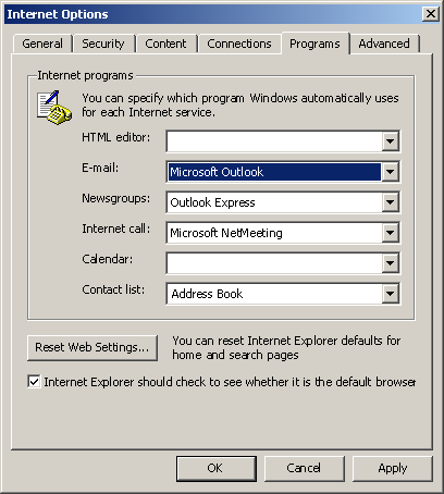
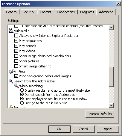
This project brings the classic Windows 9x theme to Avalonia. It is inspired by the WPF Classic Theme, with enhancements and additional controls for a more authentic look and feel. Check out the screenshots below for a preview!
Installation
- Install the
Classic.Avalonia.Themepackage via NuGet:Install-Package Classic.Avalonia.Theme - In your
App.axaml, replace the existing theme (e.g.,<FluentTheme />or<SimpleTheme />) with the Classic theme:<Application ...> <Application.Styles> <ClassicTheme /> </Application.Styles> </Application>
DataGrid
To use the DataGrid, install the Classic.Avalonia.Theme.DataGrid package and include the style in App.axaml:
<StyleInclude Source="avares://Classic.Avalonia.Theme.DataGrid/Classic.axaml"/>
ColorPicker
For the ColorPicker, install the Classic.Avalonia.Theme.ColorPicker package and include the style in App.axaml:
<StyleInclude Source="avares://Classic.Avalonia.Theme.ColorPicker/Classic.axaml"/>
Dock
There is also a classic theme for a fantastic Wieslaw's Dock control, install the Classic.Avalonia.Theme.Dock package and include the style in App.axaml:
<StyleInclude Source="avares://Classic.Avalonia.Theme.Dock/Classic.axaml" />
Color Scheme
To customize the color scheme, set the RequestedThemeVariant in App.axaml or for individual controls:
RequestedThemeVariant="{x:Static ClassicTheme.Brick}"
Font Usage
While Windows 9x used the bitmap font MS Sans Serif for its distinctive appearance, bitmap fonts have compatibility issues. Instead, the Classic.Avalonia theme uses Tahoma (introduced in Windows XP) without anti-aliasing for a similar look. Though it’s not perfect—letters may sometimes appear too close together, especially on macOS—it’s the closest match for now.
Tahoma is available on Windows and macOS, but not Linux. A free alternative, 'Wine Tahoma Regular,' is distributed under the GNU Lesser General Public License, but I’m unsure if it’s compatible with the MIT license. Any insights would be appreciated.
Custom Controls
Classic.Avalonia introduces several custom controls with a classic appearance and behavior.
These controls (excluding ClassicWindow) are part of the Classic.CommonControls.Avalonia assembly and can be used independently of Classic.Avalonia.Theme. Who knows, maybe a Luna theme is coming next?
How to use
Classic.CommonControls.Avaloniawithout Classic themeYou can use new controls without classic theming, i.e. if Classic theme is only one of many themes your app supports, but you still want to use ToolBar or MessageBox control. Just include the following style:
<StyleInclude Source="avares://Classic.CommonControls.Avalonia/Themes/Fluent.axaml" />!! Include it ONLY if you want to use new controls with
<FluentTheme />. Don't do it if you use<ClassicTheme />
ClassicWindow
By default, windows don't have the classic titlebar/chrome. To enable a classic titlebar, inherit from ClassicWindow instead of the Window class.
If inheriting from ClassicWindow isn't feasible (for example, if Classic is just one of multiple themes), you can apply the ClassicWindow theme like this:
Theme="{StaticResource ClassicWindow}"
Note: On Windows 11, the default Window class results in rounded corners, which may detract from the classic look. Inherit from ClassicWindow to avoid this.
MessageBox
For a classic Windows-style MessageBox:
var result = await MessageBox.ShowDialog(parentWindow, "This is a message box", "Title", MessageBoxButtons.Ok, MessageBoxIcon.Information);
To enable classic Windows sounds, add .UseMessageBoxSounds() in Program.cs:
public static AppBuilder BuildAvaloniaApp()
    => AppBuilder.Configure<App>()
        ...
        .UseMessageBoxSounds()
        ...

(If you can't hear the screenshot above, you might be too young!)
ToolBar
MSDN defines a toolbar as "a control containing one or more buttons."
Use <commonControls:ToolBar> to host any controls. To add buttons, use <commonControls:ToolBarButton> with properties such as Text, SmallIcon (16px), or LargeIcon (24px). Set IsToggleButton to enable toggle functionality.
The ToolBar supports small and large sizes, various text placements (Down, Right, or NoText), and can automatically grayscale icons (GrayscaleIcons).

ListView
A classic ListView which is a ListBox with a predefined template - an icon with text. Supports three views: Icon, SmallIcon, List.
Use <commonControls:ListView> with <commonControls:ListViewItem> children. If you want to bind a custom objects, use styles to bind text and icon (don't use ItemTemplate):
<commonControls:ListView.Styles>
    <Style Selector="commonControls|ListViewItem">
        <Setter Property="SmallIcon" Value="{Binding SmallIcon}" />
        <Setter Property="LargeIcon" Value="{Binding LargeIcon}" />
        <Setter Property="Text" Value="{Binding Text}" />
    </Style>
</commonControls:ListView.Styles>
![]()
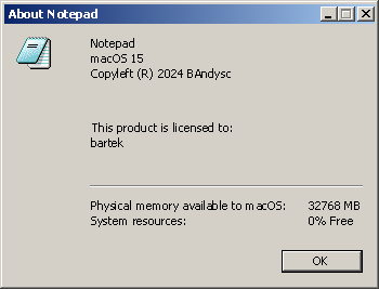
AboutDialog
For a classic Windows 9x-style 'About' dialog:
var bitmap = new Bitmap(AssetLoader.Open(new Uri("avares://YourAssembly/YourPathToIcon.png")));
await AboutDialog.ShowDialog(parentWindow, "Notepad", "Copyright (C) 1985-1999", bitmap);
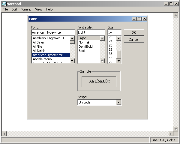
FontDialog
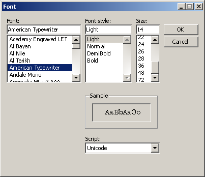
For a classic Windows Font picker dialog:
var font = await FontDialog.ShowDialog(parentWindow);
if (font != null)
{
    Font = font.Family;
    FontStyle = font.Style;
    FontWeight = font.Weight;
    FontSize = font.Size;
}
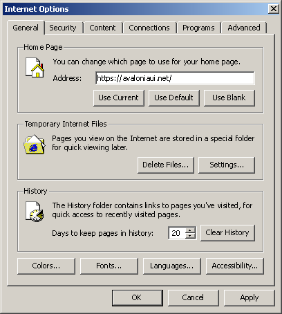
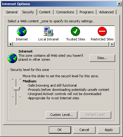
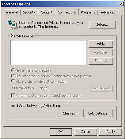
Example Screenshots
| Product | Versions Compatible and additional computed target framework versions. |
|---|---|
| .NET | net5.0 was computed. net5.0-windows was computed. net6.0 was computed. net6.0-android was computed. net6.0-ios was computed. net6.0-maccatalyst was computed. net6.0-macos was computed. net6.0-tvos was computed. net6.0-windows was computed. net7.0 was computed. net7.0-android was computed. net7.0-ios was computed. net7.0-maccatalyst was computed. net7.0-macos was computed. net7.0-tvos was computed. net7.0-windows was computed. net8.0 was computed. net8.0-android was computed. net8.0-browser was computed. net8.0-ios was computed. net8.0-maccatalyst was computed. net8.0-macos was computed. net8.0-tvos was computed. net8.0-windows was computed. |
| .NET Core | netcoreapp2.0 was computed. netcoreapp2.1 was computed. netcoreapp2.2 was computed. netcoreapp3.0 was computed. netcoreapp3.1 was computed. |
| .NET Standard | netstandard2.0 is compatible. netstandard2.1 was computed. |
| .NET Framework | net461 was computed. net462 was computed. net463 was computed. net47 was computed. net471 was computed. net472 was computed. net48 was computed. net481 was computed. |
| MonoAndroid | monoandroid was computed. |
| MonoMac | monomac was computed. |
| MonoTouch | monotouch was computed. |
| Tizen | tizen40 was computed. tizen60 was computed. |
| Xamarin.iOS | xamarinios was computed. |
| Xamarin.Mac | xamarinmac was computed. |
| Xamarin.TVOS | xamarintvos was computed. |
| Xamarin.WatchOS | xamarinwatchos was computed. |
-
.NETStandard 2.0
- Avalonia (>= 11.2.0)
- Avalonia.Skia (>= 11.2.0)
NuGet packages (1)
Showing the top 1 NuGet packages that depend on Classic.CommonControls.Avalonia:
| Package | Downloads |
|---|---|
|
Classic.Avalonia.Theme
Classic Windows-like theme for Avalonia |
GitHub repositories
This package is not used by any popular GitHub repositories.