BlazzyMotion.Gallery
1.0.0
dotnet add package BlazzyMotion.Gallery --version 1.0.0
NuGet\Install-Package BlazzyMotion.Gallery -Version 1.0.0
<PackageReference Include="BlazzyMotion.Gallery" Version="1.0.0" />
<PackageVersion Include="BlazzyMotion.Gallery" Version="1.0.0" />
<PackageReference Include="BlazzyMotion.Gallery" />
paket add BlazzyMotion.Gallery --version 1.0.0
#r "nuget: BlazzyMotion.Gallery, 1.0.0"
#:package BlazzyMotion.Gallery@1.0.0
#addin nuget:?package=BlazzyMotion.Gallery&version=1.0.0
#tool nuget:?package=BlazzyMotion.Gallery&version=1.0.0
BlazzyMotion.Gallery
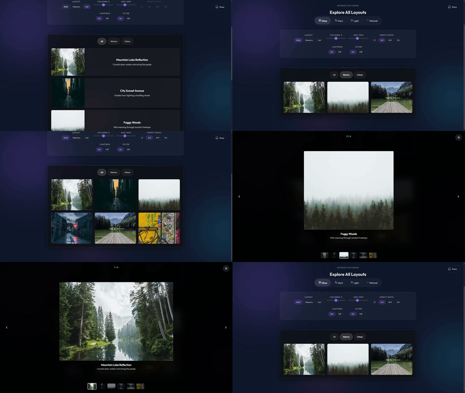
A premium image gallery component for Blazor with Grid, Masonry, and List layouts.



Table of Contents
- Features
- Live Demo
- Quick Start
- Layouts
- API Reference
- Themes
- Category Filtering
- Lightbox
- Accessibility
- Responsive Behavior
- CSS Customization
- How It Works
- Performance
- Troubleshooting
- Browser Support
- Contributing
- License
- Author
- Support
Features
- Zero Configuration - Just add
[BzImage]attribute to your model and the Source Generator handles the rest - 3 Layout Modes - Grid (uniform), Masonry (Pinterest-style), and List (horizontal cards)
- Fullscreen Lightbox - Keyboard navigation, touch swipe, zoom-in animation
- Category Filtering - Animated filter bar with smooth show/hide transitions
- Multiple Themes - Glass, Dark, Light, and Minimal themes included out of the box
- Staggered Animations - Intersection Observer-powered entrance animations per item
- Mobile Optimized - Touch swipe in lightbox, no backdrop-filter on mobile for performance
- Fully Accessible - WCAG 2.1 AA compliant with screen reader support, focus trap, keyboard navigation, and
prefers-reduced-motion
Live Demo
Experience BlazzyMotion.Gallery in action: View Live Demo
Quick Start
Installation
dotnet add package BlazzyMotion.Gallery
Or via Package Manager Console:
Install-Package BlazzyMotion.Gallery
No CSS links or service registration needed — everything loads automatically.
Basic Usage
1. Define Your Model
Mark your data model with [BzImage] to specify the image property:
using BlazzyMotion.Core.Attributes;

public class Photo
{
    [BzImage]
    public string Url { get; set; } = "";

    [BzTitle]
    public string Caption { get; set; } = "";
}
2. Use the Component
@using BlazzyMotion.Gallery.Components
@using BlazzyMotion.Core.Models

<BzGallery Items="photos" Theme="BzTheme.Glass" />

@code {
    private List<Photo> photos = new()
    {
        new Photo { Url = "/images/photo1.jpg", Caption = "Sunset" },
        new Photo { Url = "/images/photo2.jpg", Caption = "Mountains" },
        new Photo { Url = "/images/photo3.jpg", Caption = "Ocean" }
    };
}
The Source Generator automatically creates the template at compile-time.
Layouts
Grid Layout
Uniform grid with configurable aspect ratio. All images are cropped to the same dimensions.
<BzGallery Items="photos"
           Layout="BzGalleryLayout.Grid"
           Columns="3"
           AspectRatio="4/3" />
Masonry Layout
Pinterest-style layout that preserves original image aspect ratios. Uses CSS columns for a pure-CSS solution.
<BzGallery Items="photos"
           Layout="BzGalleryLayout.Masonry"
           Columns="3"
           Theme="BzTheme.Glass" />
List Layout
Horizontal cards with image on the left and text on the right. Stacks vertically on mobile.
<BzGallery Items="photos"
           Layout="BzGalleryLayout.List"
           Theme="BzTheme.Light" />
API Reference
Component Parameters
Data Parameters
| Parameter | Type | Default | Description |
|---|---|---|---|
Items |
IEnumerable<TItem>? |
null |
Collection of items to display |
ItemTemplate |
RenderFragment<TItem>? |
null |
Custom template for rendering items |
OnItemSelected |
EventCallback<TItem> |
- | Item click callback (when lightbox is disabled) |
Appearance Parameters
| Parameter | Type | Default | Description |
|---|---|---|---|
Layout |
BzGalleryLayout |
Grid |
Layout mode: Grid, Masonry, or List |
Columns |
int |
3 |
Number of columns (1-6) |
Gap |
int |
16 |
Gap between items in pixels |
AspectRatio |
string? |
null |
Image aspect ratio for Grid mode (CSS default: 4/3) |
Theme |
BzTheme |
Glass |
Visual theme: Glass, Dark, Light, or Minimal |
CssClass |
string? |
null |
Additional CSS classes for customization |
Behavior Parameters
| Parameter | Type | Default | Description |
|---|---|---|---|
EnableLightbox |
bool |
true |
Enable fullscreen lightbox on click |
EnableFilter |
bool |
false |
Show category filter bar |
CategorySelector |
Func<TItem, string>? |
null |
Function to extract category from item |
AnimationEnabled |
bool |
true |
Enable staggered entry animations |
Template Parameters
| Parameter | Type | Default | Description |
|---|---|---|---|
LoadingTemplate |
RenderFragment? |
null |
Custom loading state |
EmptyTemplate |
RenderFragment? |
null |
Custom empty state |
Themes
BlazzyMotion.Gallery includes four professionally designed themes:
Glass Theme (Default)
Modern glassmorphism design with blur effect and transparency:
<BzGallery Items="photos" Theme="BzTheme.Glass" />
Dark Theme
Solid dark background with subtle gradient border:
<BzGallery Items="photos" Theme="BzTheme.Dark" />
Light Theme
Clean light theme with soft shadows:
<BzGallery Items="photos" Theme="BzTheme.Light" />
Minimal Theme
No background container, borderless design:
<BzGallery Items="photos" Theme="BzTheme.Minimal" />
Category Filtering
Enable the filter bar to let users browse by category. Provide a CategorySelector function to extract the category from each item:
public class Photo
{
    [BzImage] public string Url { get; set; } = "";
    [BzTitle] public string Caption { get; set; } = "";
    public string Category { get; set; } = "";
}
<BzGallery Items="photos"
           EnableFilter="true"
           CategorySelector="@(p => p.Category)"
           Theme="BzTheme.Dark" />
When no CategorySelector is provided, the [BzDescription] attribute value is used as the category.
Lightbox
The fullscreen lightbox is enabled by default. It supports:
- Keyboard Navigation - Arrow keys, Home/End, Escape, Tab cycling
- Touch Swipe - Swipe left/right on mobile with cooldown guard
- Focus Trap - Tab key stays within the lightbox modal
- Focus Restore - Focus returns to the gallery item that opened the lightbox
- Screen Reader - Live region announcements, dynamic ARIA labels
- Zoom-in Animation - Smooth scale animation when opening
- Image Counter - Shows current position (e.g., "3 / 12")
- Caption Display - Shows title and description below the image
Keyboard Shortcuts
| Key | Action |
|---|---|
← |
Previous image |
→ |
Next image |
Home |
First image |
End |
Last image |
Esc |
Close lightbox |
Tab |
Cycle through controls |
Shift+Tab |
Cycle backwards |
Enter/Space |
Open lightbox from grid |
Disabling Lightbox
Use OnItemSelected instead for custom click handling:
<BzGallery TItem="Photo"
           Items="photos"
           EnableLightbox="false"
           OnItemSelected="HandlePhotoClick" />

@code {
    private void HandlePhotoClick(Photo photo)
    {
        // Navigate, open modal, etc.
    }
}
Accessibility
BlazzyMotion.Gallery is built with WCAG 2.1 AA compliance in mind, ensuring usability for screen readers, keyboard-only users, and users with motion sensitivities.
Screen Reader Support
- Lightbox uses
role="dialog"witharia-modal="true"andaria-roledescription="Image gallery lightbox" - Dynamic
aria-labelannounces image title and position (e.g., "Sunset, image 3 of 9") - Caption region uses
aria-live="polite"witharia-atomic="true"for automatic announcements on image change - Hidden
.bzg-sr-onlytext provides "Image X of Y" context for assistive technology - Thumbnail strip uses
role="tablist"withrole="tab"andaria-selectedon each thumbnail - Gallery items use
role="button"with descriptivearia-labelincluding action hints - Decorative elements are hidden with
aria-hidden="true"
Keyboard Navigation
- Gallery grid:
Tabto focus items,EnterorSpaceto open lightbox - Lightbox:
←/→navigate images,Home/Endjump to first/last,Escapecloses - Focus trap:
Tab/Shift+Tabcycle through lightbox controls without escaping - Focus restore: When lightbox closes, focus returns to the gallery item that opened it
Focus Indicators
All interactive elements display a visible 2px solid outline with 2px offset on :focus-visible, meeting WCAG 2.4.7 requirements.
Category Filter Bar
- Filter toolbar uses
role="toolbar"witharia-label="Filter by category" - Each filter button uses
aria-pressedto indicate active state - "No items match" message uses
role="status"witharia-live="polite"
Reduced Motion
When prefers-reduced-motion: reduce is enabled in the user's operating system:
- All staggered entry animations are disabled
- Image hover transitions are removed
- Lightbox zoom animation is turned off
- Content displays immediately without any motion
Tested Screen Readers
| Screen Reader | Platform | Status |
|---|---|---|
| NVDA | Windows | Supported |
| JAWS | Windows | Supported |
| Narrator | Windows | Supported |
| VoiceOver | macOS / iOS | Supported |
Responsive Behavior
| Breakpoint | Columns | Gap |
|---|---|---|
| Desktop (> 991px) | As configured | As configured |
| Tablet (600px - 991px) | 2 | 12px |
| Small mobile (< 600px) | 1 | 8px |
On mobile devices:
- Backdrop-filter is disabled for performance
- Filter bar becomes horizontally scrollable
- List layout stacks vertically (image on top, text below)
CSS Customization
Override CSS variables for custom styling:
.my-gallery {
    --bzg-columns: 4;
    --bzg-gap: 20px;
    --bzg-aspect-ratio: 16/9;
    --bzg-item-radius: 16px;
    --bzg-max-width: 1400px;
}
<BzGallery Items="photos" CssClass="my-gallery" />
Available CSS Variables
| Variable | Default | Description |
|---|---|---|
--bzg-columns |
3 |
Number of grid columns |
--bzg-gap |
16px |
Gap between items |
--bzg-aspect-ratio |
4/3 |
Image aspect ratio (Grid mode) |
--bzg-item-radius |
8px |
Item border radius |
--bzg-max-width |
1200px |
Container max width |
--bzg-border-radius |
12px |
Container border radius |
--bzg-filter-height |
44px |
Filter button height |
--bzg-filter-radius |
22px |
Filter button border radius |
--bzg-list-image-width |
300px |
Image width in List layout |
How It Works
Source Generator Magic
When you mark a property with [BzImage], the BlazzyMotion Source Generator automatically creates a registration function during compilation:
// Auto-generated at compile-time
internal static class BzMappingRegistration_Photo
{
    [ModuleInitializer]
    internal static void Register()
    {
        BzRegistry.Register<Photo>(item => new BzItem
        {
            ImageUrl = item.Url,
            Title = item.Caption,
            OriginalItem = item
        });
    }
}
The [ModuleInitializer] attribute ensures registration runs automatically at application startup - zero reflection, zero configuration.
Rendering Pipeline
- Items are mapped via
BzRegistry.ToBzItems()using the generated mapper - JavaScript module initializes IntersectionObserver for staggered animations
- Double
requestAnimationFramereveals the container (FOUC prevention) - Each item animates in as it enters the viewport
Performance
- Zero Runtime Overhead - Mapping functions generated at compile-time
- Zero Reflection - Uses
[ModuleInitializer]for automatic registration - GPU Accelerated - Animations use
will-change: transform, opacity - Intersection Observer - Only animates items when they enter viewport
- CSS-Only Masonry - Uses CSS
columnsproperty, no JavaScript layout calculation - Lazy Loading - Images use
loading="lazy"for deferred loading
Troubleshooting
Template Not Generated:
- Ensure
[BzImage]is on apublic stringproperty - Rebuild the project to trigger Source Generator
- Add
@using BlazzyMotion.Core.Attributes
Gallery Items Not Visible:
- Check that
Itemsis not null or empty - Verify image URLs are accessible
- Ensure the container has the
bzg-readyclass after initialization
Animations Not Working:
- Verify
AnimationEnabled="true" - Check browser Intersection Observer support
- Check
prefers-reduced-motionmedia query in browser settings
Filter Bar Not Showing:
- Set
EnableFilter="true" - Ensure
CategorySelectoris provided or items have[BzDescription] - At least 2 categories are needed for the filter bar to appear
Browser Support
| Browser | Version |
|---|---|
| Chrome | 88+ |
| Firefox | 78+ |
| Safari | 14+ |
| Edge | 88+ |
Requires CSS aspect-ratio support for Grid layout. Backdrop-filter for Glass theme gracefully degrades on mobile.
Contributing
Contributions are welcome! Please feel free to submit issues or pull requests.
Building from Source
git clone https://github.com/Blazzy-Motion/BlazzyMotion.git
cd BlazzyMotion
dotnet build
Running Tests
dotnet test
License
MIT License - see LICENSE for details.
Author
- GitHub: @nenad0707
- LinkedIn: Nenad Ristic
Support
If you find BlazzyMotion.Gallery useful, please consider:
- Giving it a star on GitHub
- Sharing it with other Blazor developers
- Reporting bugs or suggesting features via GitHub Issues
For questions or support, please open an issue on GitHub.
Part of the BlazzyMotion component ecosystem.
| Product | Versions Compatible and additional computed target framework versions. |
|---|---|
| .NET | net8.0 is compatible. net8.0-android was computed. net8.0-browser was computed. net8.0-ios was computed. net8.0-maccatalyst was computed. net8.0-macos was computed. net8.0-tvos was computed. net8.0-windows was computed. net9.0 was computed. net9.0-android was computed. net9.0-browser was computed. net9.0-ios was computed. net9.0-maccatalyst was computed. net9.0-macos was computed. net9.0-tvos was computed. net9.0-windows was computed. net10.0 was computed. net10.0-android was computed. net10.0-browser was computed. net10.0-ios was computed. net10.0-maccatalyst was computed. net10.0-macos was computed. net10.0-tvos was computed. net10.0-windows was computed. |
-
net8.0
- BlazzyMotion.Core (>= 1.3.1)
- Microsoft.AspNetCore.Components.Web (>= 8.0.0)
NuGet packages
This package is not used by any NuGet packages.
GitHub repositories
This package is not used by any popular GitHub repositories.
| Version | Downloads | Last Updated |
|---|---|---|
| 1.0.0 | 197 | 2/13/2026 |
| 1.0.0-preview1 | 141 | 2/10/2026 |