BlazzyMotion.Carousel
1.4.1
dotnet add package BlazzyMotion.Carousel --version 1.4.1
NuGet\Install-Package BlazzyMotion.Carousel -Version 1.4.1
<PackageReference Include="BlazzyMotion.Carousel" Version="1.4.1" />
<PackageVersion Include="BlazzyMotion.Carousel" Version="1.4.1" />
<PackageReference Include="BlazzyMotion.Carousel" />
paket add BlazzyMotion.Carousel --version 1.4.1
#r "nuget: BlazzyMotion.Carousel, 1.4.1"
#:package BlazzyMotion.Carousel@1.4.1
#addin nuget:?package=BlazzyMotion.Carousel&version=1.4.1
#tool nuget:?package=BlazzyMotion.Carousel&version=1.4.1
BlazzyMotion.Carousel
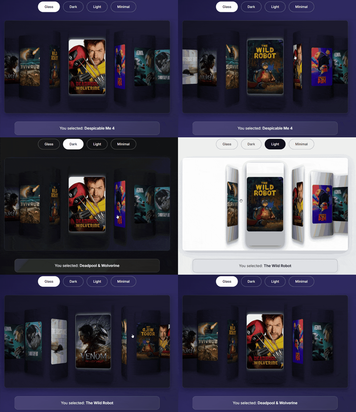
A modern, high-performance 3D carousel component for Blazor with zero-configuration support through Source Generators.



⚠️ Migration Guide
Upgrading from v1.0.x to v1.1.x
Version 1.1.0 introduces a modular architecture with BlazzyMotion.Core as shared infrastructure. This brings one breaking change:
BzTheme Namespace Change
Before (v1.0.x):
@using BlazzyMotion.Carousel.Models

<BzCarousel Items="movies" Theme="BzTheme.Glass" />
After (v1.1.x):
@using BlazzyMotion.Core.Models

<BzCarousel Items="movies" Theme="BzTheme.Glass" />
Attributes (No Change Required)
Both namespaces work for backward compatibility:
// ✅ Old namespace (still works)
using BlazzyMotion.Carousel.Attributes;

// ✅ New namespace (recommended)
using BlazzyMotion.Core.Attributes;
Quick Fix
If you see compiler errors after upgrading, simply update your _Imports.razor:
+ @using BlazzyMotion.Core.Models
  @using BlazzyMotion.Carousel.Components
Table of Contents
- BlazzyMotion.Carousel
- ⚠️ Migration Guide
- Table of Contents
- Features
- Live Demo
- Quick Start
- How It Works
- API Reference
- Attributes
- Themes
- Mobile Optimization
- Advanced Usage
- Customization
- Responsive Design
- Performance
- Browser Support
- Examples
- Validation and Diagnostics
- Troubleshooting
- Roadmap
- Contributing
- License
- Author
- Acknowledgments
- Support
Features
- Zero Configuration: Use Source Generators to automatically create item templates from your data models
- 3D Coverflow Effect: Stunning visual presentation powered by Swiper.js
- Multiple Themes: Glass, Dark, Light, and Minimal themes included out of the box
- Adaptive Modes: Automatically adjusts between coverflow and simple slider based on item count
- Fully Customizable: Extensive API for fine-tuning appearance and behavior
- Type-Safe: Strongly-typed generic component with full IntelliSense support
- Responsive Design: Built-in responsive behavior for desktop, tablet, and mobile devices
- Performance Optimized: Template caching and incremental source generation for minimal overhead
Live Demo
Experience BlazzyMotion.Carousel in action: View Live Demo
Quick Start
Installation
Install the package via NuGet:
dotnet add package BlazzyMotion.Carousel
Or via the Package Manager Console:
Install-Package BlazzyMotion.Carousel
Basic Usage
1. Define Your Model
Mark your data model with the [BzImage] attribute to specify which property contains the image URL:
using BlazzyMotion.Carousel.Attributes;

public class Movie
{
    [BzImage]
    public string Poster { get; set; } = "";

    [BzTitle]  // Optional: for accessibility (alt text)
    public string Title { get; set; } = "";
}
2. Use the Component
That's it! No need to define an ItemTemplate:
@page "/movies"
@using BlazzyMotion.Carousel.Components

<BzCarousel Items="movies" />

@code {
    private List<Movie> movies = new()
    {
        new Movie { Poster = "/images/movie1.jpg", Title = "Inception" },
        new Movie { Poster = "/images/movie2.jpg", Title = "Interstellar" },
        new Movie { Poster = "/images/movie3.jpg", Title = "The Dark Knight" }
    };
}
Note: TItem can be omitted in simple cases. However, it must be specified when using event callbacks like OnItemSelected, OnActiveItemChanged, or OnActiveIndexChanged.
The Source Generator automatically creates the template for you at compile-time.
How It Works
Source Generator Magic
When you mark a property with [BzImage], the BlazzyMotion Source Generator automatically creates a registration function during compilation:
// Auto-generated at compile-time
internal static class BzMappingRegistration_Movie
{
    [ModuleInitializer]
    internal static void Register()
    {
        BzRegistry.Register<Movie>(item => new BzItem
        {
            ImageUrl = item.Poster,
            Title = item.Title,
            OriginalItem = item
        });
    }
}
The [ModuleInitializer] attribute ensures this registration runs automatically at application startup, before any of your code executes. BlazzyMotion.Carousel then uses the registered mapper from BzRegistry to render your items - with zero reflection and zero configuration.
Template Priority
The component uses the following priority when selecting a template:
- Manual Template -
ItemTemplateparameter if provided - Generated Template - Auto-generated from
[BzImage]attribute - Fallback Template - Simple text representation
API Reference
Component Parameters
Data Parameters
| Parameter | Type | Default | Description |
|---|---|---|---|
Items |
IEnumerable<TItem> |
Required | Collection of items to display in the carousel |
ItemTemplate |
RenderFragment<TItem>? |
null |
Custom template for rendering items (overrides generated template) |
OnItemSelected |
EventCallback<TItem> |
- | Callback invoked when an item is clicked |
OnActiveItemChanged |
EventCallback<TItem> |
- | Callback fired on every scroll/swipe, ideal for preview panels |
OnActiveIndexChanged |
EventCallback<int> |
- | Callback fired with zero-based slide index on change |
Appearance Parameters
| Parameter | Type | Default | Description |
|---|---|---|---|
Theme |
BzTheme |
Glass |
Visual theme: Glass, Dark, Light, or Minimal |
ShowOverlay |
bool |
true |
Whether to show gradient overlay on slides |
CssClass |
string? |
null |
Additional CSS classes for customization |
Width |
string? |
null |
Max width (e.g., "500" for 500px, or "80%") |
Height |
string? |
null |
Height (e.g., "300" for 300px, or "50vh") |
Behavior Parameters
| Parameter | Type | Default | Description |
|---|---|---|---|
Loop |
bool |
true |
Enable infinite loop navigation |
InitialSlide |
int |
0 |
Index of the initially active slide |
MinItemsForLoop |
int |
4 |
Minimum items required to enable loop mode |
SelectOnScroll |
bool |
true |
When false, OnItemSelected fires only on click, not on scroll |
AutoDetectMode |
bool |
true |
Automatically switch between coverflow and simple modes |
MinItemsForCoverflow |
int |
4 |
Minimum items for coverflow effect (below uses simple slider) |
Effect Parameters
| Parameter | Type | Default | Description |
|---|---|---|---|
RotateDegree |
int |
50 |
Rotation angle for coverflow effect (degrees) |
Depth |
int |
150 |
Depth of the coverflow effect |
Advanced Parameters
| Parameter | Type | Default | Description |
|---|---|---|---|
Options |
BzCarouselOptions? |
null |
Advanced carousel options (overrides individual parameters) |
LoadingTemplate |
RenderFragment? |
null |
Custom loading state template |
EmptyTemplate |
RenderFragment? |
null |
Custom empty state template |
AdditionalAttributes |
Dictionary<string, object>? |
null |
HTML attributes to splat onto root element (id, aria-, data-) |
Attributes
BzImageAttribute
Marks a property as the image source for carousel items. The Source Generator creates a default template using this property.
Requirements:
- Property must be
public - Property must be of type
string - Only one property per class should have this attribute
[BzImage]
public string ImageUrl { get; set; }
BzTitleAttribute
Marks a property as the title/alt text for carousel items. Used for accessibility attributes on generated img elements.
[BzTitle]
public string Name { get; set; }
BzDescriptionAttribute
Reserved for future use (tooltips, captions, etc.). Currently not used by the default template generator.
[BzDescription]
public string Description { get; set; }
Themes
BlazzyMotion.Carousel includes four professionally designed themes:
Glass Theme (Default)
Modern glassmorphism design with blur effect and transparency:
<BzCarousel Items="items" Theme="BzTheme.Glass" />
Dark Theme
Solid dark background with subtle gradients:
<BzCarousel Items="items" Theme="BzTheme.Dark" />
Light Theme
Clean light theme with soft shadows:
<BzCarousel Items="items" Theme="BzTheme.Light" />
Minimal Theme
No background container, pure carousel:
<BzCarousel Items="items" Theme="BzTheme.Minimal" />
Mobile Optimization
BlazzyMotion.Carousel includes mobile-optimized touch settings out of the box:
// These are the defaults - no configuration needed!
var options = new BzCarouselOptions
{
    TouchRatio = 1.0,        // Normal touch sensitivity
    Threshold = 10,          // Minimum 10px movement to trigger swipe
    ShortSwipes = false,     // Disabled to prevent glitchy behavior
    ResistanceRatio = 0.85,  // Light resistance at edges
    LongSwipesRatio = 0.3    // 30% slide width to advance
};
Customizing Touch Behavior
<BzCarousel Items="products" Options="@touchOptions" />

@code {
    private BzCarouselOptions touchOptions = new()
    {
        Threshold = 15,        // Require more deliberate swipe
        ShortSwipes = true,    // Enable quick flicks if desired
    };
}
Touch Options Reference
| Option | Default | Range | Description |
|---|---|---|---|
TouchRatio |
1.0 |
0.1 - 2.0 | Touch sensitivity multiplier |
Threshold |
10 |
0 - 50 | Minimum pixels to trigger swipe |
ShortSwipes |
false |
bool | Allow quick flick gestures |
ResistanceRatio |
0.85 |
0 - 1 | Edge bounce resistance |
LongSwipesRatio |
0.3 |
0.1 - 0.9 | Slide width % to advance |
SpaceBetween |
0 |
0 - 100+ | Gap between slides in pixels |
💡 Tip: If you experience glitchy behavior on mobile, try increasing
Thresholdto 15-20.
Advanced Usage
Custom Item Template
If you need full control over item rendering, provide a custom template:
<BzCarousel Items="products">
    <ItemTemplate Context="product">
        <div class="custom-slide">
            <img src="@product.Image" alt="@product.Name" />
            <h3>@product.Name</h3>
            <p class="price">$@product.Price</p>
        </div>
    </ItemTemplate>
</BzCarousel>
Handling Item Selection
React to user clicks on carousel items:
<BzCarousel TItem="Movie"
            Items="movies"
            OnItemSelected="HandleMovieClick" />

@code {
    private void HandleMovieClick(Movie movie)
    {
        Console.WriteLine($"Selected: {movie.Title}");
        // Navigate, open modal, etc.
    }
}
Preview Panel Pattern
Use OnActiveItemChanged for live preview while browsing, and SelectOnScroll="false" when click means navigation:
<BzCarousel TItem="Movie"
            Items="movies"
            SelectOnScroll="false"
            OnItemSelected="NavigateToMovie"
            OnActiveItemChanged="ShowPreview" />

<div class="preview-panel">
    @if (previewMovie != null)
    {
        <h3>@previewMovie.Title</h3>
        <p>@previewMovie.Description</p>
    }
</div>

@code {
    private Movie? previewMovie;

    private void ShowPreview(Movie movie) => previewMovie = movie;

    private void NavigateToMovie(Movie movie)
    {
        Navigation.NavigateTo($"/movie/{movie.Id}");
    }
}
Advanced Configuration
Use BzCarouselOptions for fine-grained control:
<BzCarousel Items="items" Options="customOptions" />

@code {
    private BzCarouselOptions customOptions = new()
    {
        Effect = "coverflow",
        SlidesPerView = "auto",
        Loop = true,
        Speed = 500,
        RotateDegree = 45,
        Depth = 200,
        Modifier = 1.5,
        SlideShadows = true
    };
}
Custom Loading State
Provide a custom loading template:
<BzCarousel Items="asyncItems">
    <LoadingTemplate>
        <div class="custom-loader">
            <span>Loading amazing content...</span>
        </div>
    </LoadingTemplate>
</BzCarousel>
Custom Empty State
Handle empty data gracefully:
<BzCarousel Items="emptyList">
    <EmptyTemplate>
        <div class="no-data">
            <p>No items available at this time.</p>
        </div>
    </EmptyTemplate>
</BzCarousel>
Customization
CSS Variables
BlazzyMotion.Carousel uses CSS custom properties for easy customization:
:root {
  /* Dimensions */
  --bzc-slide-width: 180px;
  --bzc-image-max-width: 160px;
  --bzc-swiper-height: 400px;

  /* Effects */
  --bzc-hover-scale: 1.05;
  --bzc-active-scale: 1.1;
  --bzc-transition-duration: 0.3s;

  /* Theme Colors */
  --bzc-glass-bg: rgba(15, 15, 15, 0.6);
  --bzc-glass-border: rgba(255, 255, 255, 0.15);
  --bzc-glass-blur: 12px;
}
Override these in your app's CSS:
.my-custom-carousel {
  --bzc-slide-width: 250px;
  --bzc-hover-scale: 1.08;
  --bzc-glass-blur: 20px;
}
<BzCarousel Items="items" CssClass="my-custom-carousel" />
Responsive Design
BlazzyMotion.Carousel automatically adapts to different screen sizes:
- Desktop (> 991px): Full-size slides with maximum effects
- Tablet (600-991px): Medium-sized slides
- Mobile (< 600px): Compact slides optimized for touch
You can override responsive behavior via CSS variables in media queries.
Performance
Performance Characteristics
- Zero Runtime Overhead: Mapping functions are generated at compile-time
- Zero Reflection: Uses
[ModuleInitializer]for automatic registration at app startup - Type Safety: Full compile-time checking of property names and types
- O(1) Lookup: Dictionary-based mapper lookup per type
- Compiled Delegates: Mapping functions are compiled, not interpreted
The entire system is designed for maximum performance with no runtime code generation or reflection.
Browser Support
BlazzyMotion.Carousel supports all modern browsers:
- Chrome/Edge (90+)
- Firefox (88+)
- Safari (14+)
- Mobile browsers (iOS Safari, Chrome Mobile)
Requires CSS backdrop-filter support for Glass theme (gracefully degrades on older browsers).
Examples
Movie Gallery
public class Movie
{
    [BzImage]
    public string Poster { get; set; } = "";

    [BzTitle]
    public string Title { get; set; } = "";

    public int Year { get; set; }
}
<BzCarousel Items="movies"
            Theme="BzTheme.Glass"
            OnItemSelected="ViewMovieDetails" />
Product Showcase
public class Product
{
    [BzImage]
    public string ImageUrl { get; set; } = "";

    [BzTitle]
    public string Name { get; set; } = "";

    public decimal Price { get; set; }
}
<BzCarousel Items="products"
            Theme="BzTheme.Light"
            RotateDegree="30"
            Depth="100" />
Team Members
public class TeamMember
{
    [BzImage]
    public string Photo { get; set; } = "";

    [BzTitle]
    public string Name { get; set; } = "";

    public string Position { get; set; } = "";
}
<BzCarousel Items="team"
            Theme="BzTheme.Minimal"
            ShowOverlay="false" />
Validation and Diagnostics
The Source Generator provides compile-time validation:
BZC001: Non-Public Property
Error BZC001: Property 'ImageUrl' with [BzImage] attribute must be public
Fix: Change property accessibility to public.
BZC002: Non-String Property
Error BZC002: Property 'ImageData' with [BzImage] attribute must be of type 'string'
Fix: Ensure the property is of type string (URL or path).
Troubleshooting
Template Not Generated
Problem: Component shows fallback template instead of generated one.
Solution:
- Ensure
[BzImage]attribute is applied to apublic stringproperty - Rebuild the project to trigger Source Generator
- Check build output for any BZC001 or BZC002 errors
Carousel Not Visible
Problem: Carousel container is present but slides are not visible.
Solution:
- Check that
Itemscollection is not null or empty - Verify image URLs are valid and accessible
- Inspect browser console for JavaScript errors
Roadmap
Planned features for future releases:
- Navigation Controls: Previous/Next buttons and pagination indicators
- Autoplay Mode: Automatic slide progression with configurable intervals
- Keyboard Navigation: Arrow key support for accessibility
- ARIA Attributes: Enhanced screen reader support
- Lazy Loading: On-demand image loading for large datasets
- Virtual Scrolling: Performance optimization for 1000+ items
Contributing
Contributions are welcome! Please feel free to submit issues or pull requests.
Building from Source
git clone https://github.com/Blazzy-Motion/BlazzyMotion.git
cd BlazzyMotion
dotnet build
Running Tests
dotnet test
License
This project is licensed under the MIT License - see the LICENSE file for details.
Author
- GitHub: @nenad0707
- LinkedIn: Nenad Ristić
Acknowledgments
- Built with Swiper.js for 3D carousel effects
- Inspired by modern UI/UX design principles and glassmorphism trends
- Thanks to the Blazor community for feedback and support
Support
If you find BlazzyMotion.Carousel useful, please consider:
- Giving it a star on GitHub
- Sharing it with other Blazor developers
- Reporting bugs or suggesting features via GitHub Issues
For questions or support, please open an issue on GitHub.
| Product | Versions Compatible and additional computed target framework versions. |
|---|---|
| .NET | net8.0 is compatible. net8.0-android was computed. net8.0-browser was computed. net8.0-ios was computed. net8.0-maccatalyst was computed. net8.0-macos was computed. net8.0-tvos was computed. net8.0-windows was computed. net9.0 was computed. net9.0-android was computed. net9.0-browser was computed. net9.0-ios was computed. net9.0-maccatalyst was computed. net9.0-macos was computed. net9.0-tvos was computed. net9.0-windows was computed. net10.0 was computed. net10.0-android was computed. net10.0-browser was computed. net10.0-ios was computed. net10.0-maccatalyst was computed. net10.0-macos was computed. net10.0-tvos was computed. net10.0-windows was computed. |
-
net8.0
- BlazzyMotion.Core (>= 1.3.1)
- Microsoft.AspNetCore.Components.Web (>= 8.0.0)
NuGet packages
This package is not used by any NuGet packages.
GitHub repositories
This package is not used by any popular GitHub repositories.
| Version | Downloads | Last Updated |
|---|---|---|
| 1.4.1 | 813 | 2/13/2026 |
| 1.4.0 | 275 | 2/6/2026 |
| 1.4.0-preview1 | 143 | 2/1/2026 |
| 1.3.0 | 317 | 1/10/2026 |
| 1.3.0-preview1 | 134 | 1/5/2026 |
| 1.2.0 | 253 | 12/23/2025 |
| 1.2.0-preview1 | 150 | 12/21/2025 |
| 1.1.0 | 242 | 12/19/2025 |
| 1.1.0-preview3 | 320 | 12/16/2025 |
| 1.1.0-preview2 | 308 | 12/15/2025 |
| 1.0.0 | 696 | 12/3/2025 |
| 1.0.0-preview2 | 694 | 12/2/2025 |
| 1.0.0-preview1 | 696 | 12/1/2025 |